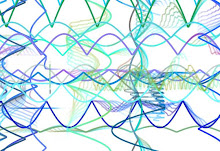
Triangle Tessellation

Tessellations Self Assessment
1. Which tessellation did you find more interesting to do? In what ways was it more interesting than the other? Please explain. Personally, I found the triangle tessellation more interesting to do. This is because it made a variety of patterns throughout the piece, when in the rectangle tessellation there was only one pattern the entire time. Also, there were more things that I learned how to do in Photoshop while making the rectangle design, such as flipping a layer to make in match up better with the original. Overall, the process of doing the triangular tessellation was more interesting because of the new tools i discovered how to use in photoshop.
2. Look at your peers' work on the ning . Which two designs do you find the most successful? What qualities make them so successful? The two designs that I found the most successful were Adrian’s rectangular one and Dan’s triangular one. I find Adrian’s very successful because of the effective color scheme. The use of the gradient tool to go across nearly the entire spectrum makes the design very interesting to look at. I find Dan’s successful because of how he used the colors and black and white to create an interesting design. With the dramatic switches from colored to black and white, it almost appears as though he altered the original image.
Adrian's: http://adriancdesign09.blogspot.com/
Dan's: http://dancdesign.wordpress.com/
3. Looking at the Grading Criteria for each design, how would you rate BOTH designs on a scale of 1-4, 4 being the highest? Please explain each grade. I would rate the first design, the rectangular tessellation, a 3.5. This is because although it is an interesting design, it can be seen that not very much time was spent on it. If I were to do this again, I would spend more time trying to come up with a way to make the shark look more like a shark, or use another animal altogether. I do, however, think the gradient tool is used effectively.
I would rate the second design, the triangular tessellation, a 4. This is because it is an overall very successful design, with the image it created and the color scheme. It was originally a picture of the end of a chocolate bar, and I took a part of the end and the background. The yellowish color at the end makes for a very interesting design to look at. Also, the combination of yellow, a shade of orange, and brown make for an effective color scheme, they make for an analogous color scheme.

No comments:
Post a Comment